Building an AI Visibility Dashboard for Your Team
What does a real AI visibility dashboard look like, and how do you tie ChatGPT, Perplexity, and Gemini mentions to pipeline your exec team can see?

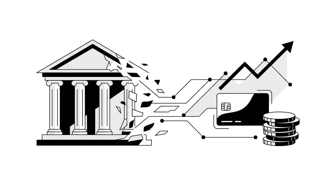
Most teams track AI visibility the same way they tracked SEO ten years ago: sporadically, in spreadsheets, and only when someone asks. The fix is not more data. It is a single dashboard that maps AI mentions to business outcomes -- one view that shows whether your brand is being recommended, in which contexts, and whether that is changing week over week. Without that connective layer between raw mention counts and pipeline impact, AI visibility stays a vanity metric instead of a growth lever.
Why Spreadsheet Tracking Fails at Scale
Manual tracking breaks down for a predictable reason. AI platforms generate responses dynamically, so the same prompt can produce different brand mentions on Tuesday than it did on Monday. A spreadsheet captures snapshots. A dashboard captures trends.
- Volume problem: A single product category might generate dozens of prompt variations across ChatGPT, Perplexity, Gemini, and Copilot. Manually querying each one is unsustainable past five or six prompts.
- Staleness problem: By the time you paste results into a sheet, the responses may have already shifted. AI models update their behavior continuously.
- Context problem: Knowing your brand was mentioned tells you little. Knowing it was mentioned as the recommended option in a purchase-intent prompt tells you a lot.
Agencies managing multiple clients feel this most acutely. If you are running GEO optimization across ten accounts, you need a system that scales beyond copy-paste.
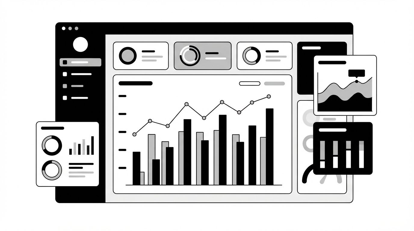
The Four Layers of a Useful AI Visibility Dashboard
The diagram below shows the four layers that separate a useful dashboard from a data dump.
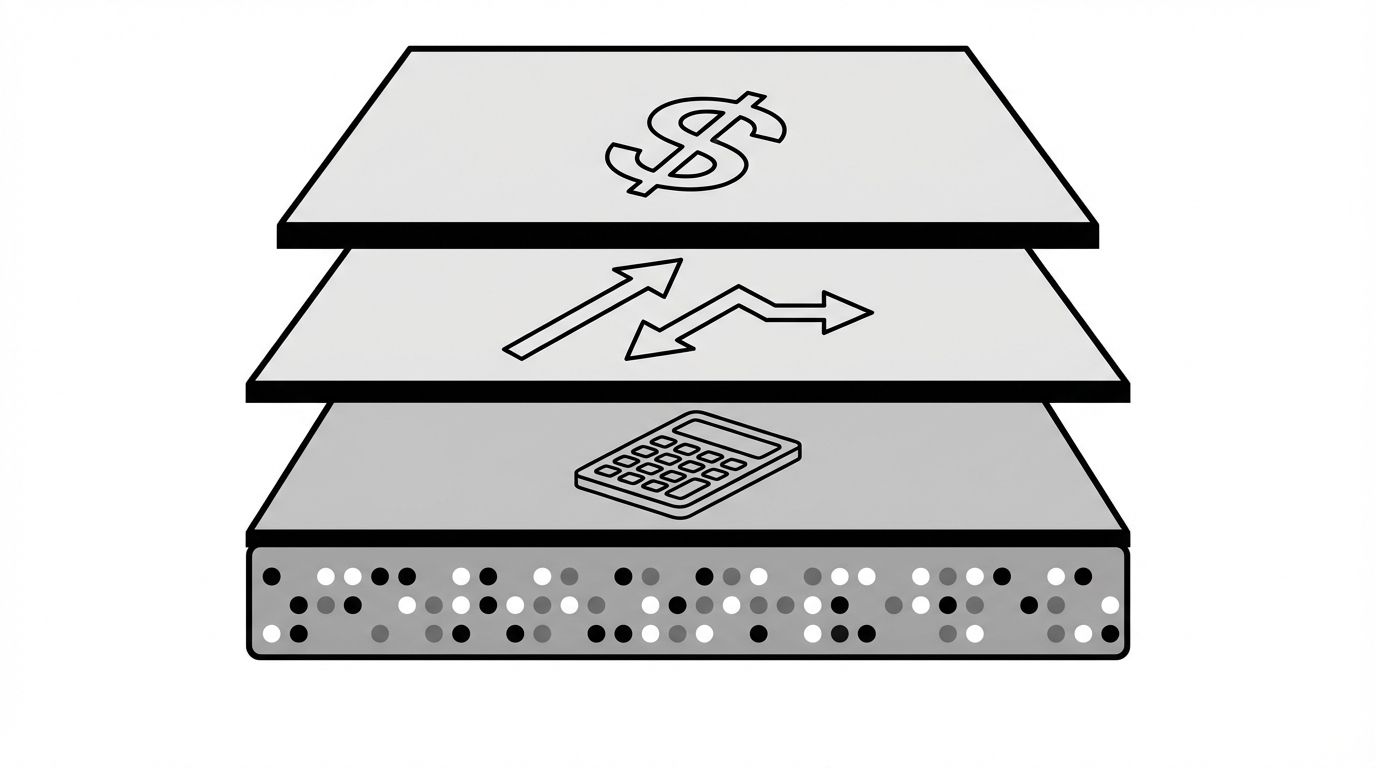
Layer 1: Data Collection
Your dashboard needs automated prompt monitoring across platforms. Define a set of prompts that represent your key buying scenarios -- product comparisons, "best of" queries, problem-solution lookups -- and track responses daily.
- Track mention presence (are you named?), mention position (first, second, buried?), and mention sentiment (recommended, cautioned against, neutral?)
- Cover at least ChatGPT, Perplexity, and Google AI Overviews -- these three capture the majority of AI-driven discovery
Layer 2: Metric Calculation
Raw mentions become useful when you calculate rates:
- Mention rate: Percentage of tracked prompts where your brand appears
- Top-position rate: Percentage of mentions where you are the first or primary recommendation
- Competitor share: How your mention rate compares to your top three competitors
- Sentiment distribution: Ratio of positive, neutral, and negative mentions
These four metrics give your team a scoreboard. For a deeper breakdown of which metrics matter and why, see our guide on AI visibility metrics.
Layer 3: Trend Analysis
A single week of data is noise. Four to six weeks of data is a signal. Your dashboard should show trendlines, not just current numbers.
- Week-over-week changes in mention rate flag whether your content efforts are working
- Competitor trend overlays reveal when a rival's content push is eating into your share
- Platform-specific trends expose which AI engines respond fastest to your optimization efforts
Layer 4: Business Mapping
This is the layer most teams skip, and it is the one that makes the dashboard worth building. Connect your AI visibility data to downstream metrics:
- Map AI referral traffic to your analytics platform
- Track conversion rates from AI-referred sessions separately
- Calculate cost-per-mention relative to the content investment that drove it
When your dashboard shows that a 12% increase in Perplexity mention rate correlated with a 9% increase in demo requests, you have a story executives will fund.
Building for Agency Scale
If you manage multiple clients, your dashboard needs a multi-tenant layer. Each client gets their own prompt set, competitor list, and metric history. The rollup view shows you which clients are gaining AI share and which are losing it.
- Client-level alerts: Notify account managers when a client's mention rate drops below a threshold or a competitor overtakes them
- Reporting templates: Automate weekly or monthly reports that pull directly from the dashboard -- no manual screenshot assembly
- Benchmark comparisons: Show clients how their AI visibility compares to industry averages
Geology's agency solution is built around exactly this workflow, with multi-client dashboards and automated reporting baked in.
What to Do Next
Start with the minimum viable version. Pick ten prompts that represent your highest-value buying scenarios. Track them daily across two platforms for four weeks. Build a simple view with mention rate, top-position rate, and competitor share. If the trends tell a story, expand from there.
If you want to skip the manual setup, Geology's platform automates all four layers -- from prompt monitoring through executive-ready reporting -- across every major AI engine.
Deeper into AI visibility dashboards
Once the four-layer model clicks, the next questions are usually about layout, ownership, and how the dashboard plugs into the rest of your reporting stack. The posts below go deeper on each of those threads.
If you want a panel-by-panel reference for what an executive-facing version should actually look like, the AI visibility dashboard template walks through the four panels worth keeping and the eight worth cutting.
Before you start wiring anything, decide whether to build it in-house or buy a platform. Our build vs buy guide for AI visibility dashboards breaks down the real cost (the data plumbing) and the threshold where building stops paying off.
The dashboard is only as useful as the goals behind it. The piece on AI visibility KPIs and OKRs covers which numbers belong as monitored KPIs and which deserve quarterly targets, so the dashboard reflects strategy instead of activity.
When it's time to take the dashboard to the C-suite, the format shifts. Our guide to AI visibility reporting for executives covers what to keep, what to cut, and how to frame the numbers in P&L terms.
The actionable layer underneath the dashboard is citations. The post on tracking AI citations shows how to map which URLs and publishers AI models reference, so you can turn visibility gaps into a content target list.
If you're still validating that AI visibility matters before investing in a platform, start with the rundown of free tools to check your AI visibility, which covers the manual methods that get you to a first signal in an afternoon.